Problem: When the Glazer Children's Museum was preparing to open its doors, it had a logo it couldn't change and six months to build an entire brand around it. The existing mark leaned on primary colors, dated typography, and silhouettes of children that spoke to no one in particular. The challenge wasn't just visual, it was strategic. How do you build a brand that playfully introduces a cultural institution to everyone it serves?
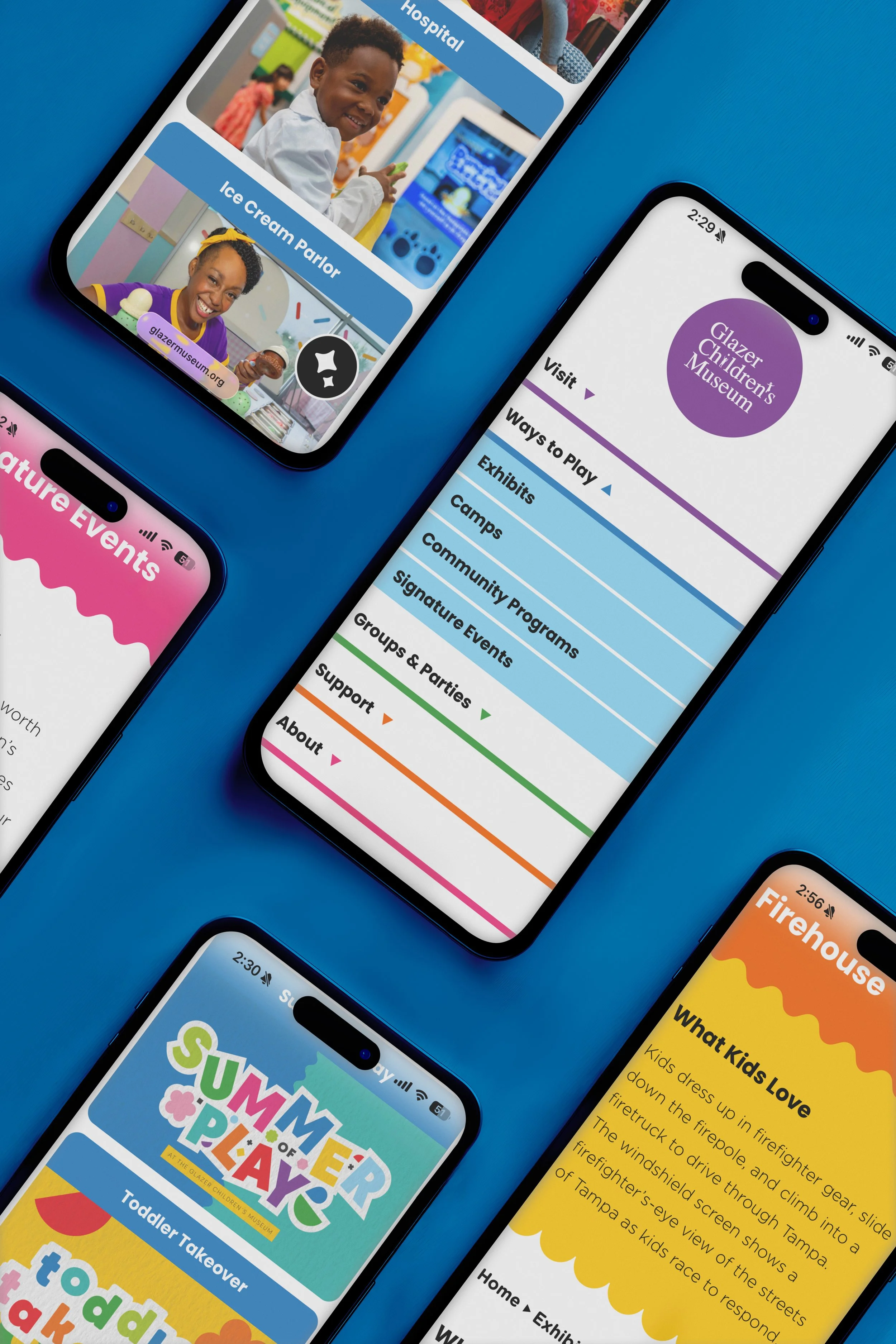
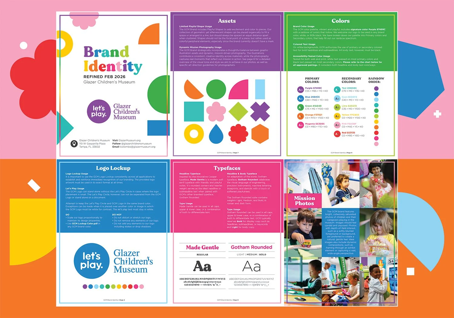
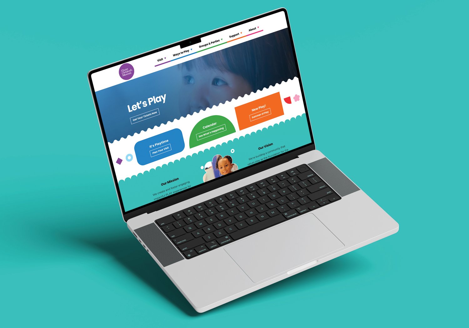
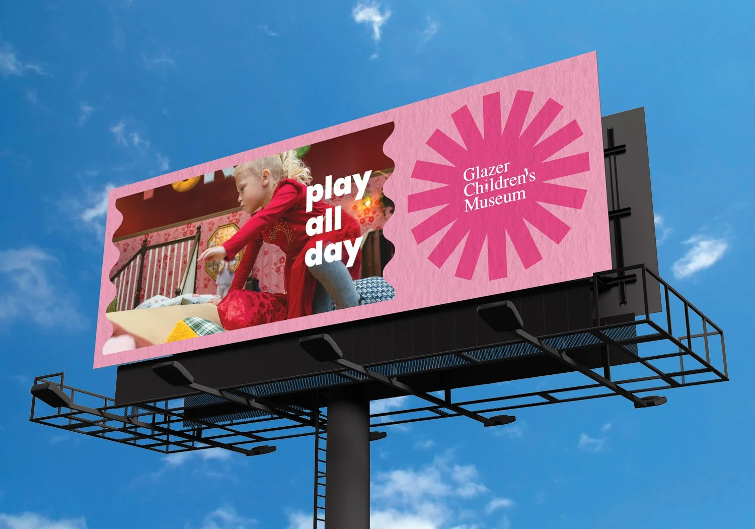
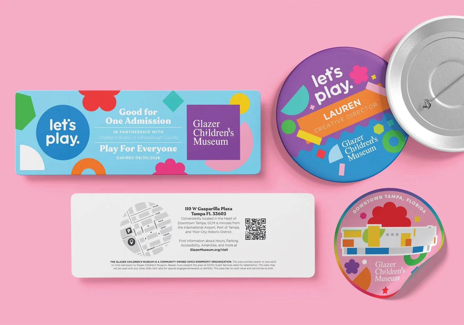
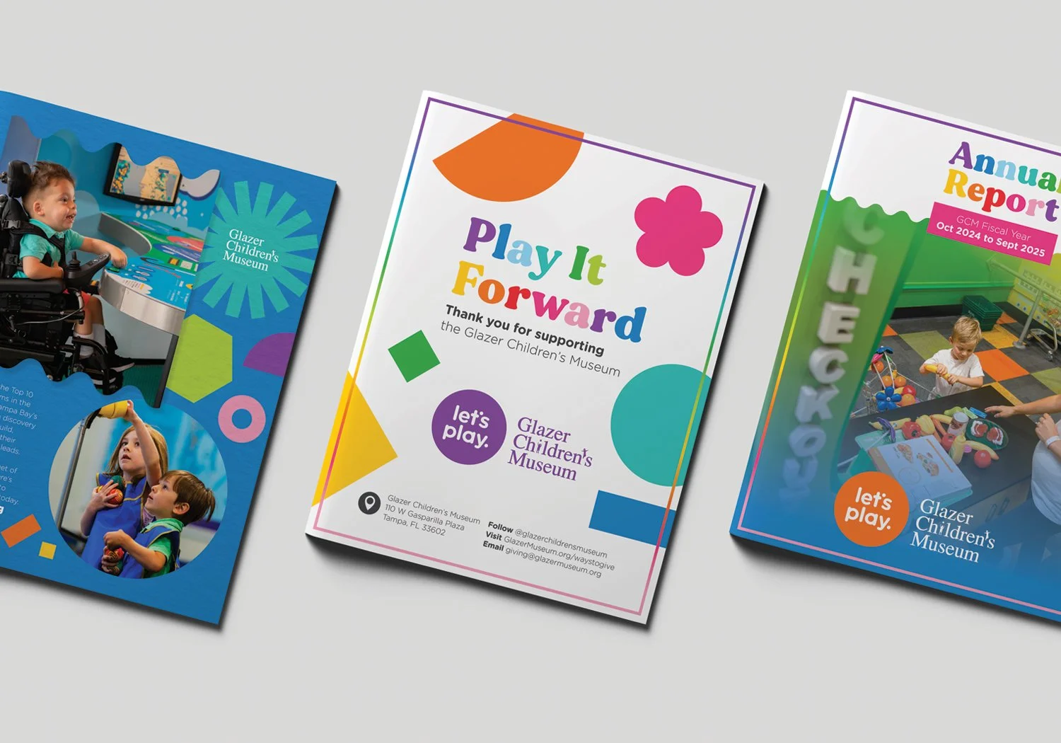
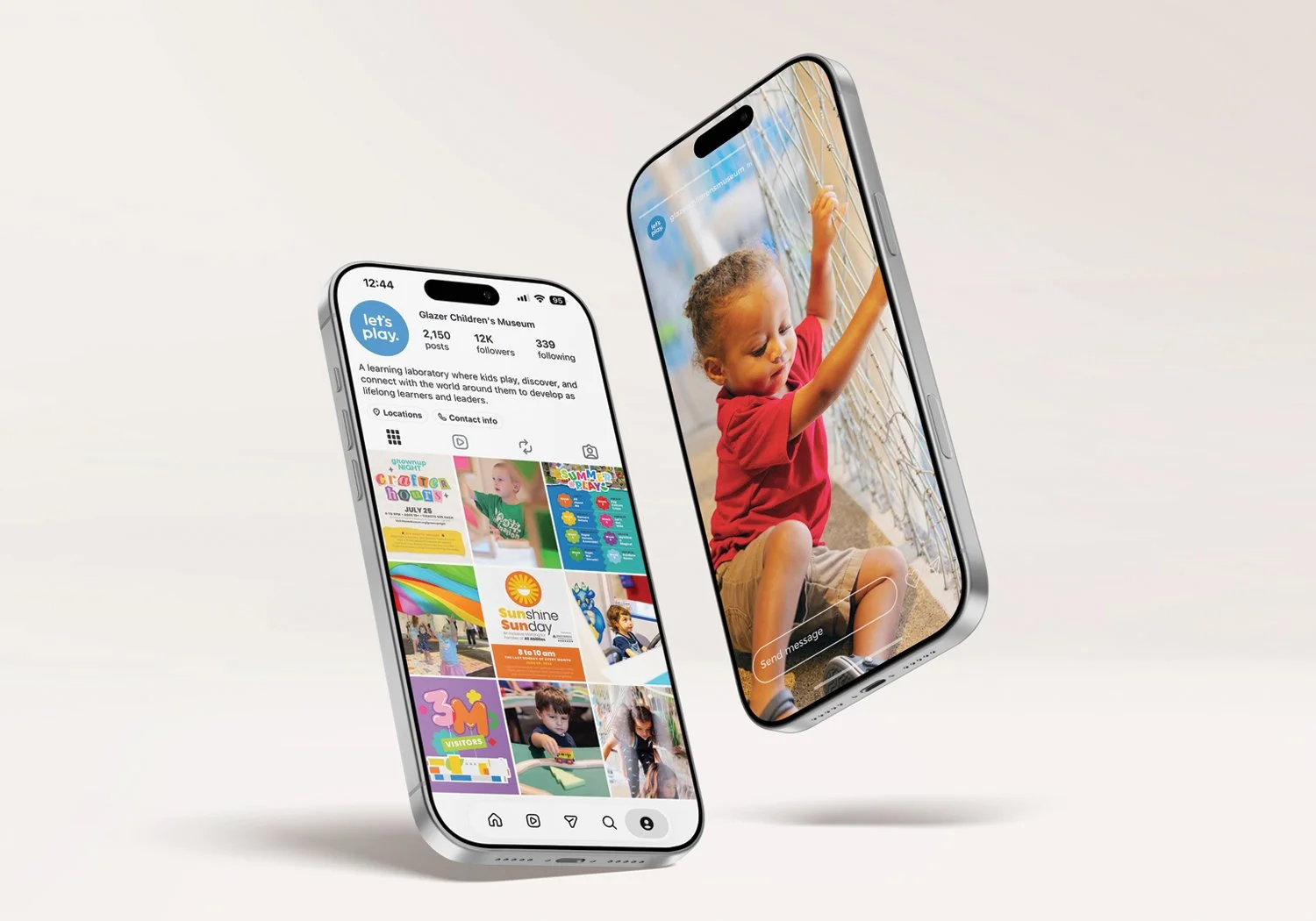
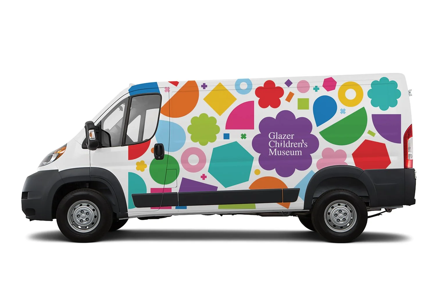
Process: The answer started with a single executive decision to remove the primary colors from the logo, render it in white, and let it live inside a bold, contemporary color system. From there, every visual asset was built from scratch, from an accessibility-tested palette and scalable typography to hand-drawn iconography, story-driven photography and video, and a warm brand voice that earns confidence in GCM as a thought leader and educational resource.
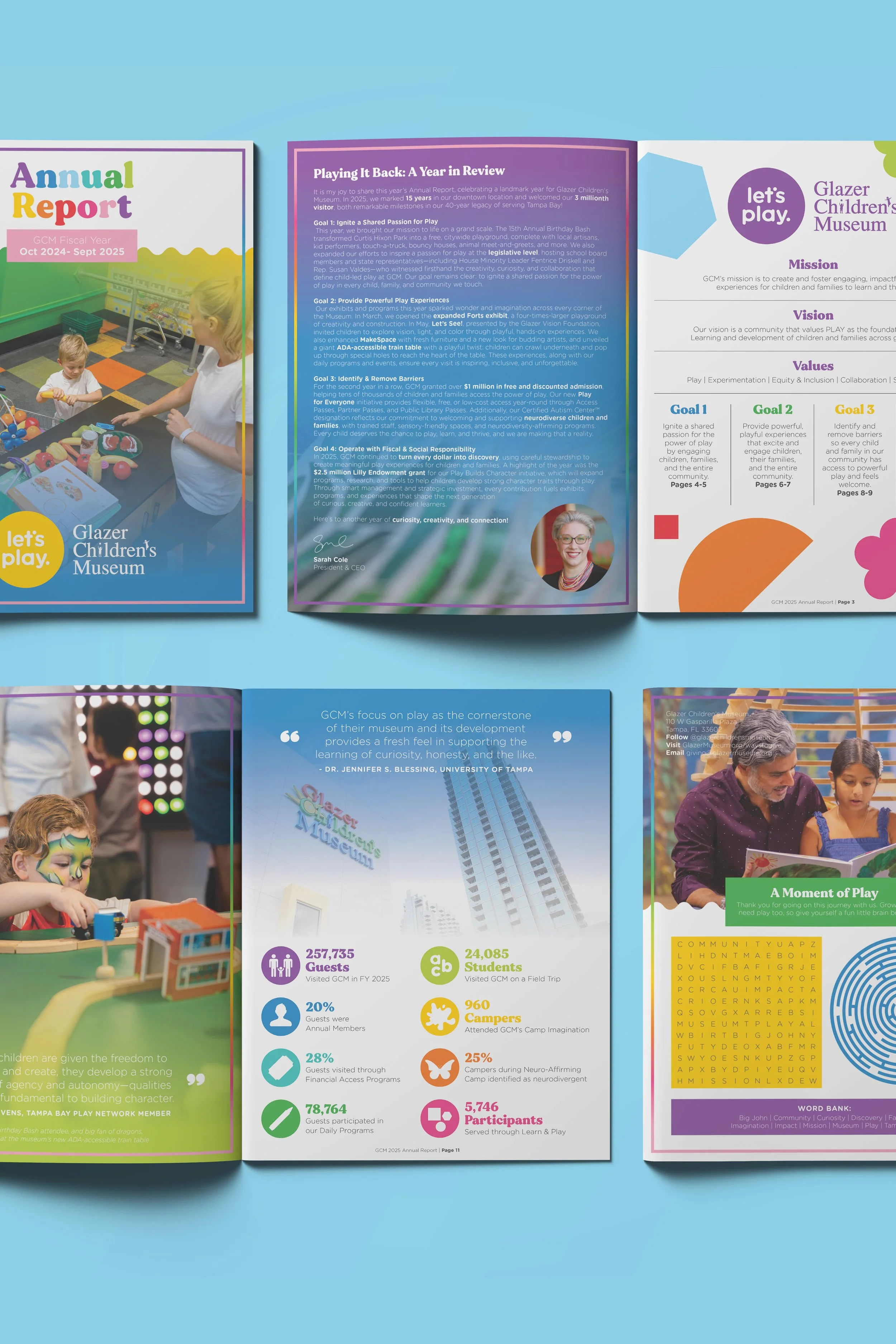
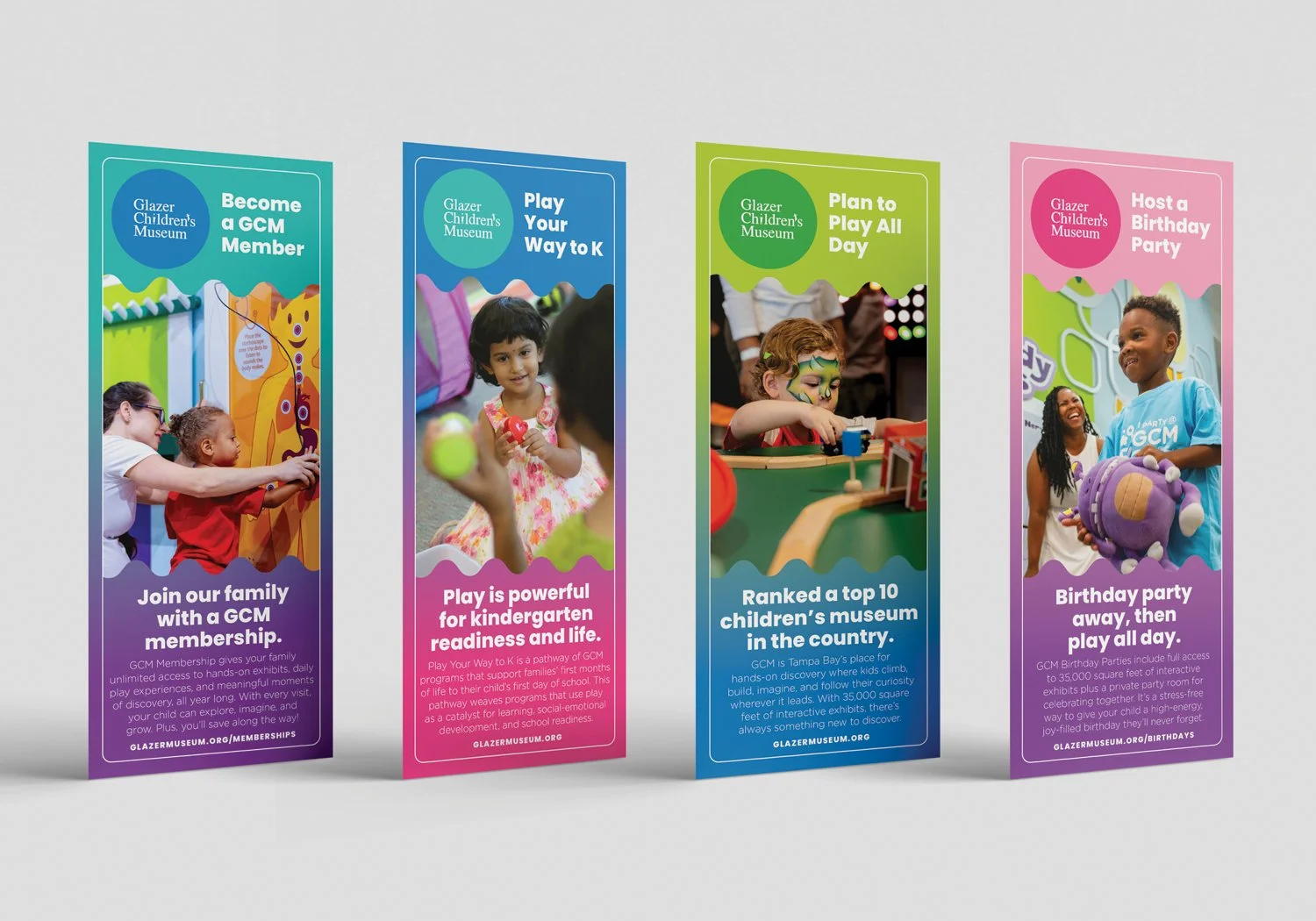
The system was designed from day one to scale across distinct audience tracks: exhibits for visitors, programs for families and educators, and fundraisers for donors. Each needed its own visual personality while remaining unmistakably part of the same family.
Outcome: The brand launched with the museum on opening day and has continued to evolve over 15 years, growing into a comprehensive identity system that supports a 53,000 square foot facility welcoming more than 250,000 annual visitors and sustaining a $4.5M annual operating budget. The result is a brand so woven into the fabric of the institution that it's impossible to imagine one without the other.
Brand
Identity