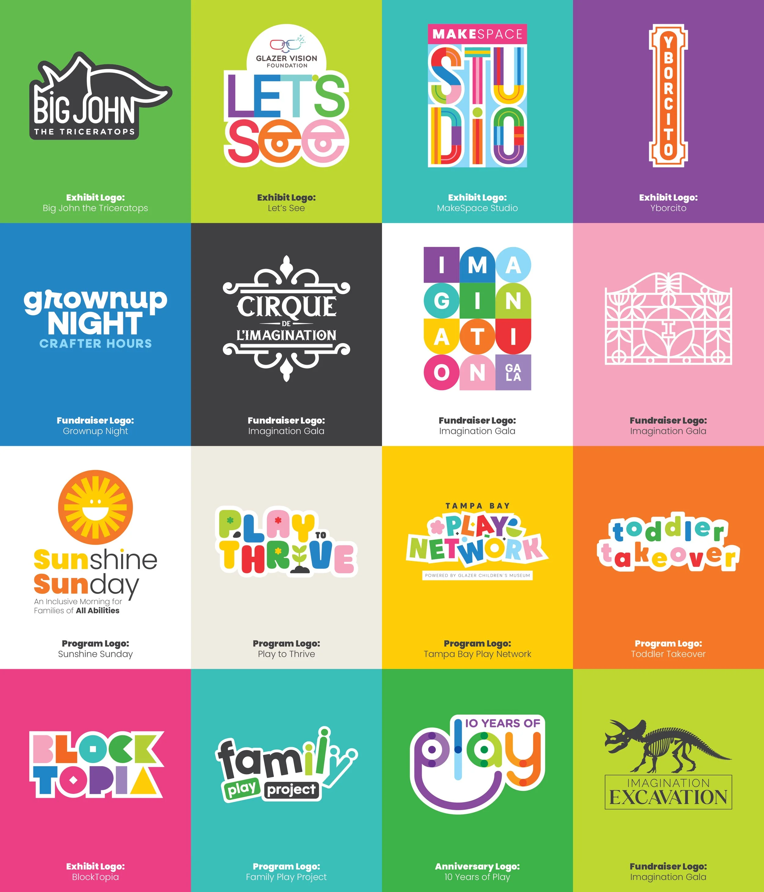
Problem: A children's museum holds many stories under one roof. Every exhibit, program, and fundraiser needs its own distinct mark, one that speaks directly to its audience, whether that's a curious kid, a classroom educator, or a gala donor. The challenge is designing marks that feel individual and purposeful while still living comfortably inside a shared brand system. Too far in one direction, and the family falls apart.
Process: Every mark starts with the same question: who is this for, and what should they feel? The answer shapes everything, from the typography and color choices to the level of playfulness or sophistication in the form. A logo for Toddler Takeover and a logo for Cirque de l'Imagination are solving completely different problems, even though they share the same brand DNA. The work is in finding the visual language that feels inevitable for each one.
Outcome: A growing family of marks that each hold their own while holding together, recognizable as part of the same world but distinct enough to do their individual jobs with confidence.
Logo
Design